Welcome Text Here. TG Superstar Pro Settings / Translations
Login
Galaxy S6 edge+
Galaxy S6 edge+
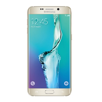
The Samsung Galaxy S6 edge+ is a stunning phone to look at, one that has literally turned heads in our 10 days of daily use. Its curved screen edges make its design stand out from the crowd, so if ever you wanted a phone to get tongues wagging then, well, this is the one.
But just because it's attractive does that justify its ?749 price tag? As the larger 5.7-inch version of the earlier 5.1-inch S6 edge model, the S6 edge+ fails to truly capitalise on that curved edge design in terms of software functionality, with many accusing its curves as being mere vacuous aesthetic. Maybe, but just look at it.
Without the Samsung Galaxy Note 5 coming to the UK (for now), though, we think Samsung has made an interesting play on these shores: pushing the S6 edge+ into its top tier position with few competitive distractions. If you have the cash to cover the price of this Plus size flagship is it as thrilling and radical as the original edge model?
SGS6 edge Plus review: Why the curved screen edge?
Having a phone with a curved screen that partially displays to both left and right sides isn't just about looking good. The S6 edge+ continues with the "People edge" feature, used to quickly access up to five individual favourite contacts, but also adds a second "Apps edge" for quick-access to up to five personally selected apps. Juggling between these two screens is as simple as a sideward swipe from the edge of the phone.
That's the main use for the curved edge, with an information stream – accessed by, somewhat strangely, rubbing the edge up and down – available to show off alerts, Yahoo! news, Twitter trends, and some other limited options. It's a nice idea, but one we rarely used, as the usual Android alerts at the top of the screen continue to appear and are altogether more familiar. If the phone is face down it will emit a colourful illumination for alerts if active too.
At night the option for a night clock is great though, as the Super AMOLED panel of the phone means only the necessary pixels illuminate for a non-distracting display. It's easily visible from a horizontal sleeping position thanks to that curved edge. It's subtle features like this that add to the edge+'s appeal.
However, compared to the original Note Edge from 2014 – which had just the one right-hand curved edge rather than both sides like the edge+ – there's simply not the same depth of functionality in the Apps edge feature. There's been time for Samsung to forge forward and integrate the edge app concepts yet more, but in the edge+ it feels ultimately the same as before. We feel that there's more potential to be unlocked yet.
Powered by OpenCart Made by ThemeGlobal - OpenCart Template Club
